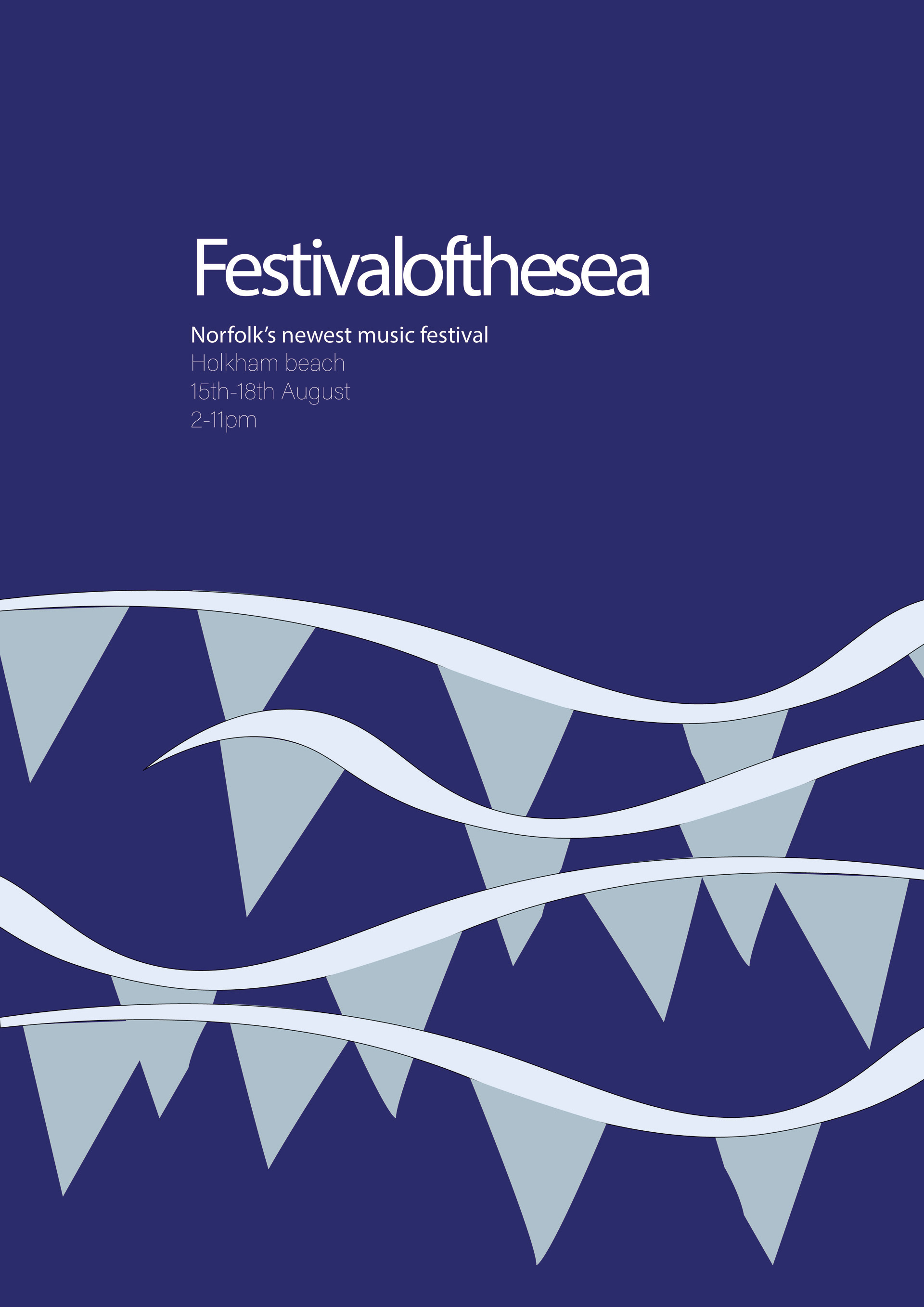
Using the visual associations related to my two words of festival and sea to design a poster celebrating an event.
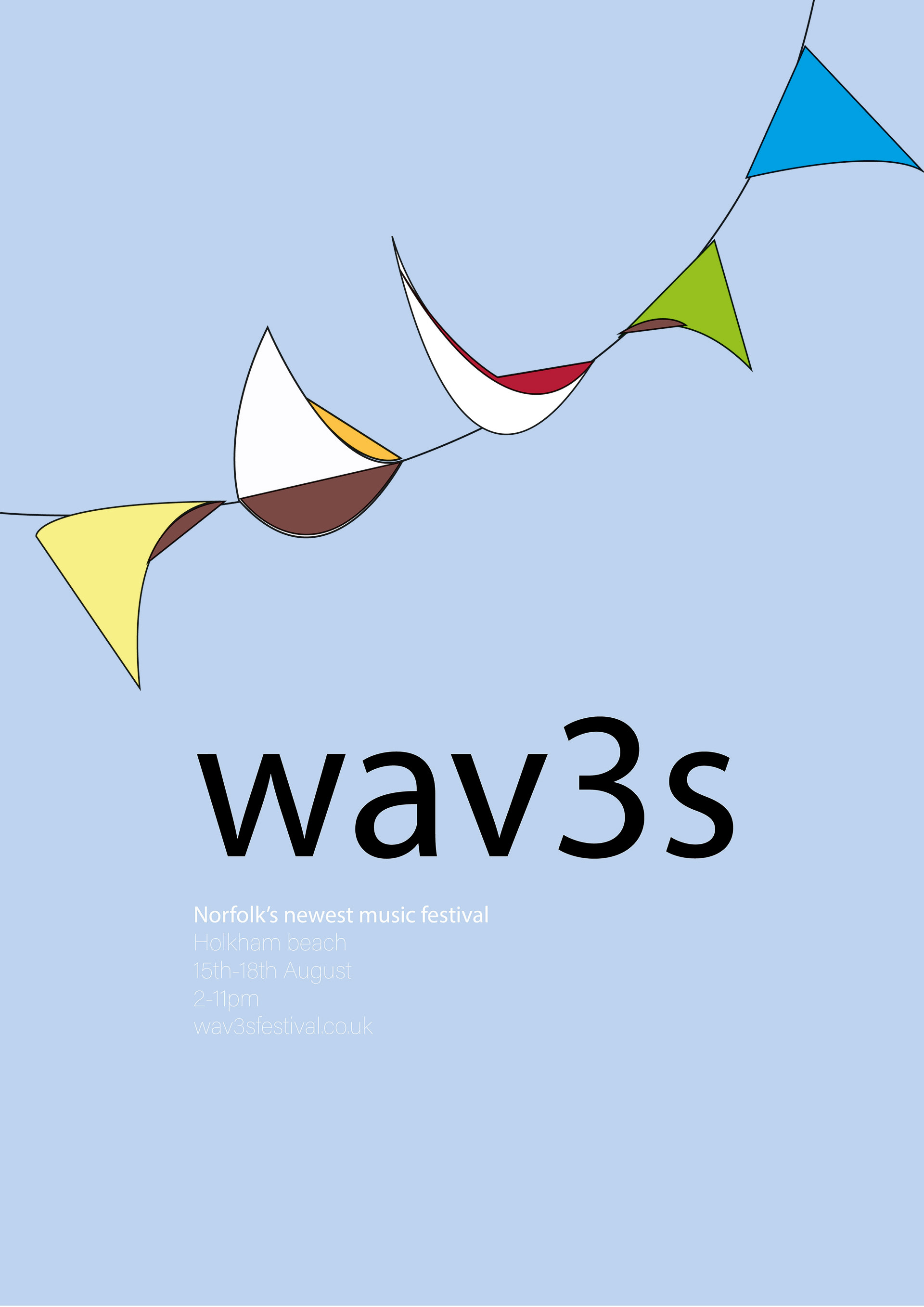
(Above:) initial poster ideas combining festival and sea.
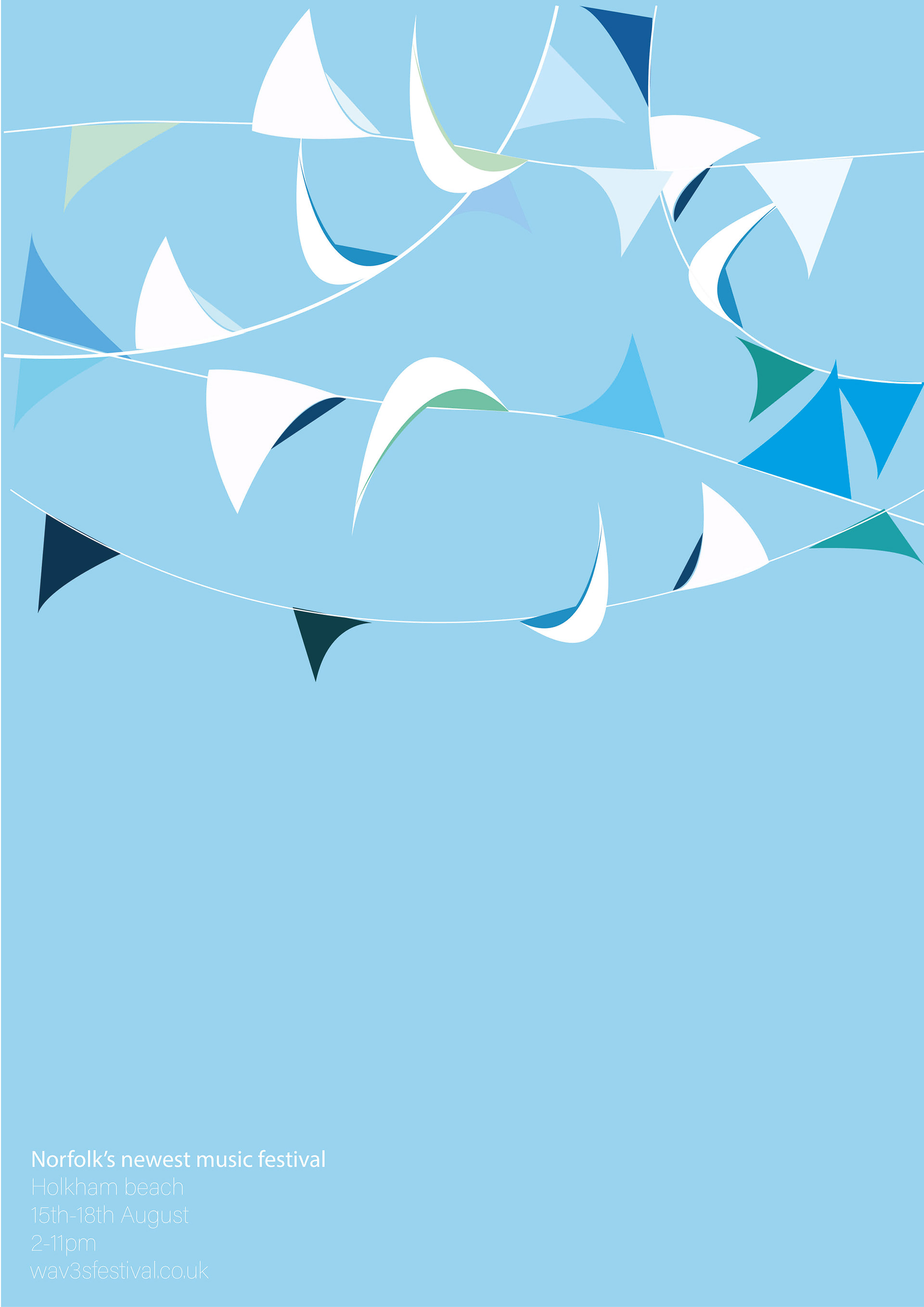
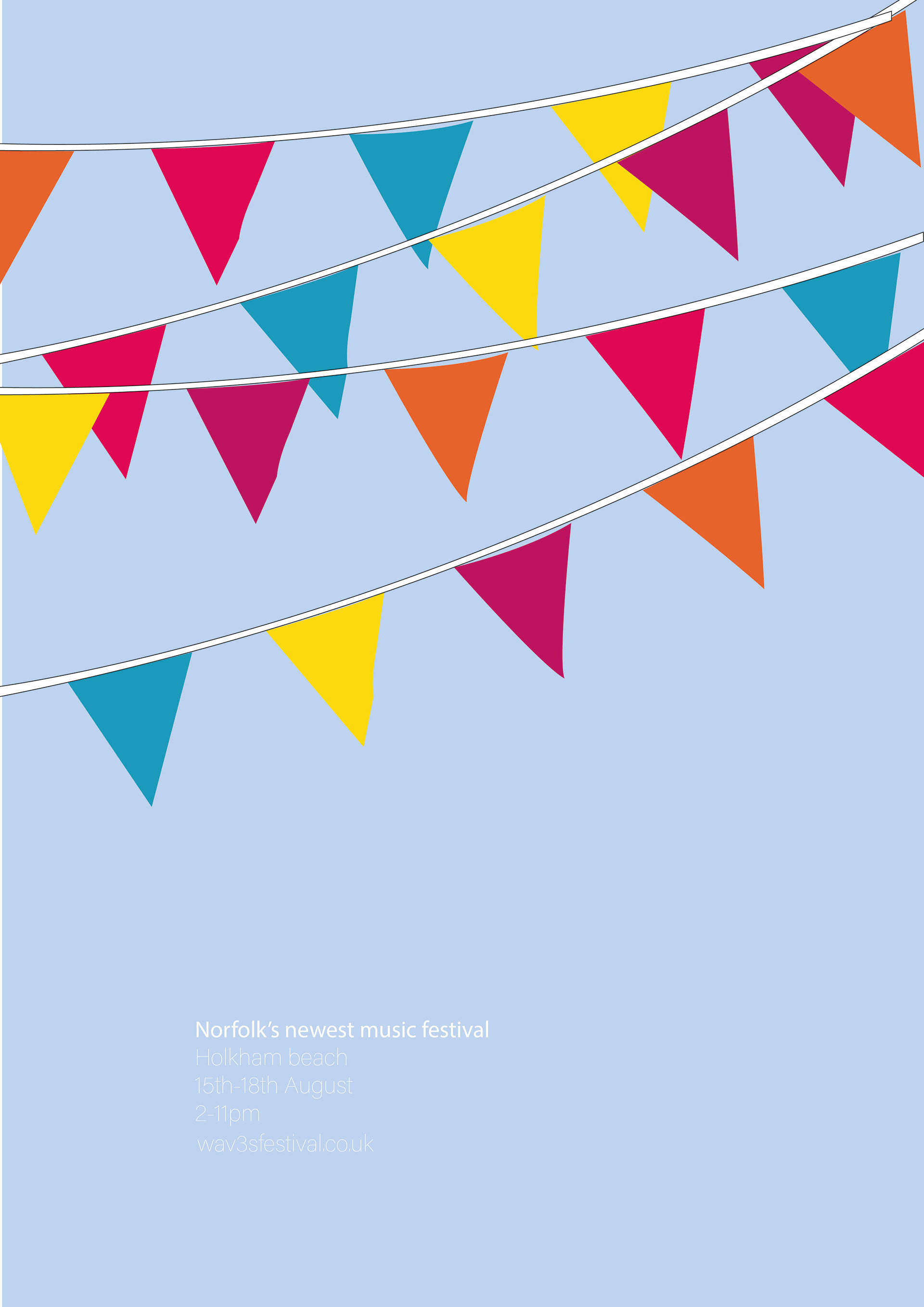
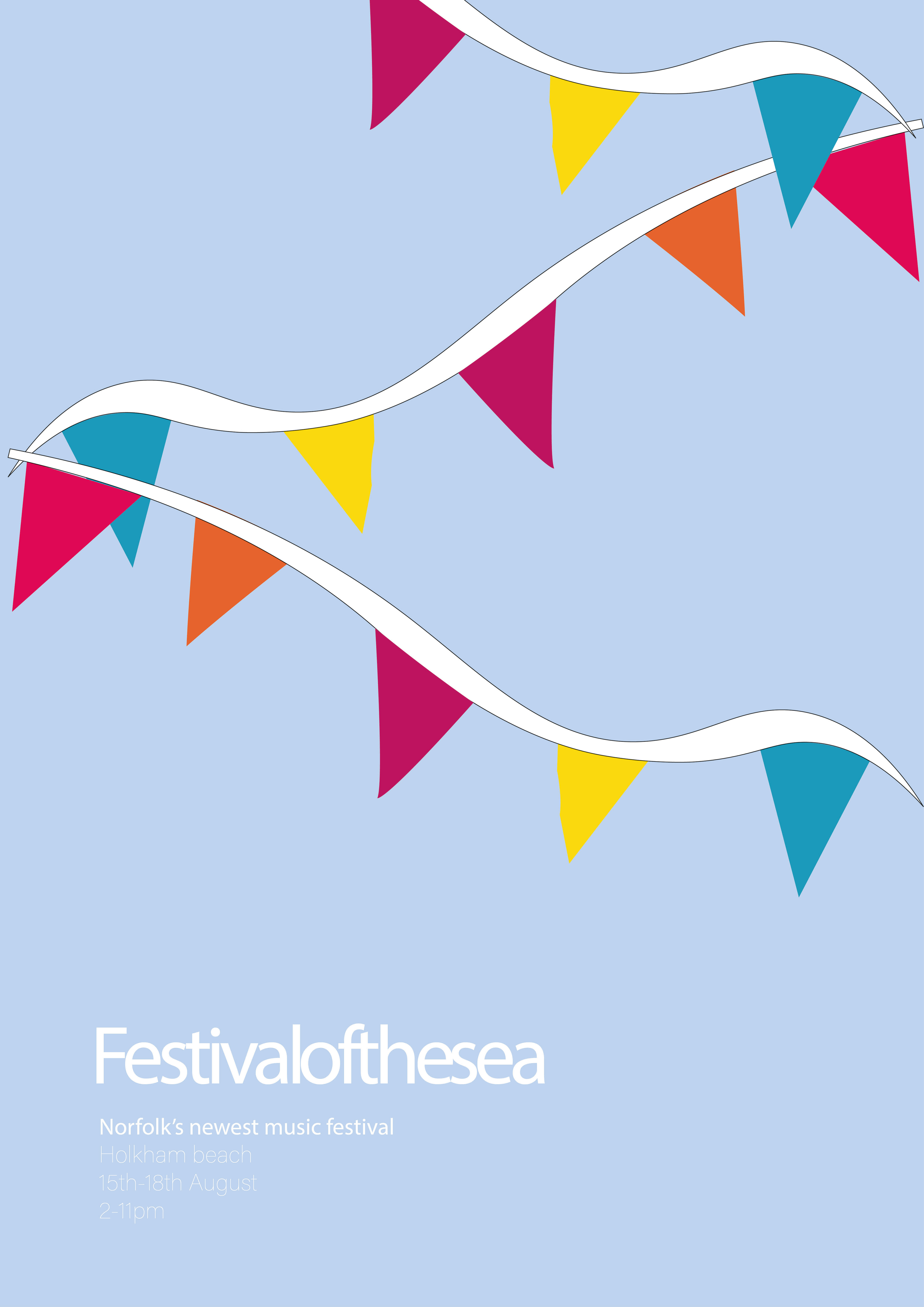
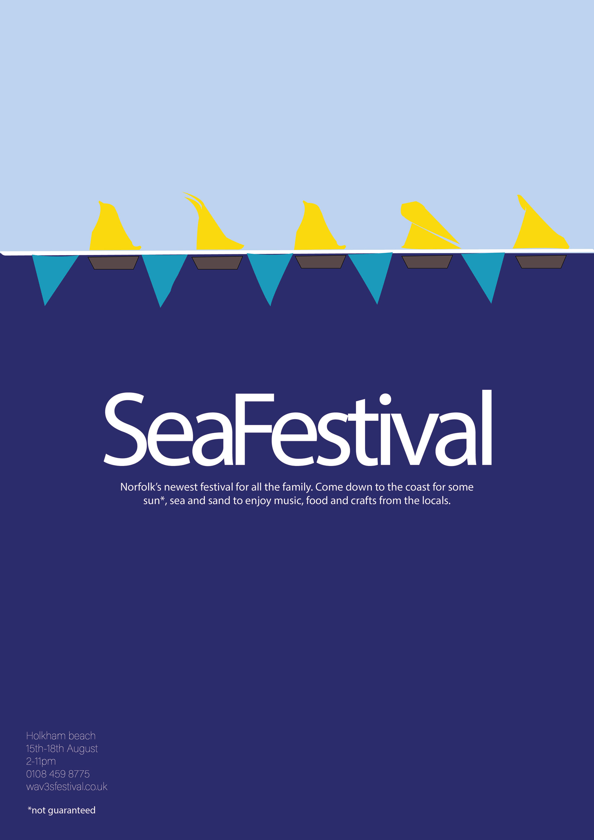
(Above:) development of poster ideas. Bunting as waves in the sea. Trialling how colour effects the communication, all one tone of blue, a mix of blue tones or combining multiple colours (to link more to bunting). Also looking at the width of the wave/string.

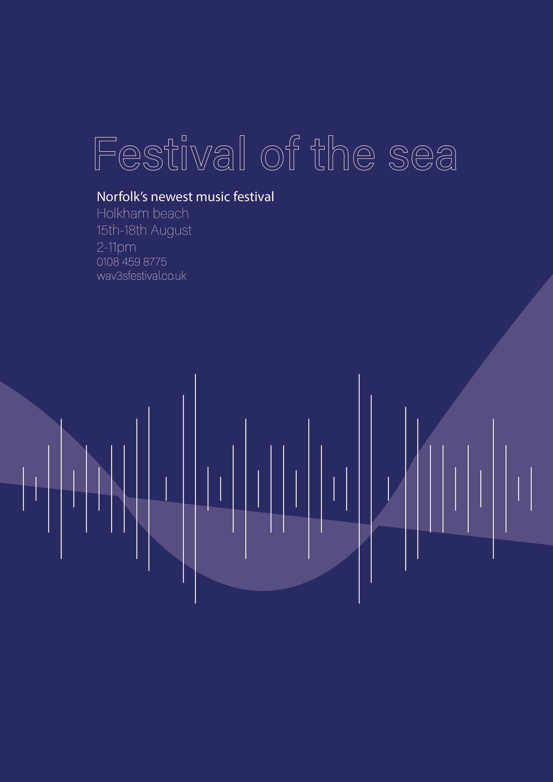
(Above:) print of a2 poster. Use of varying wave widths and a mix of blue toned flags. Contains essential contact information (website + phone number) and festival details (time + place + date).
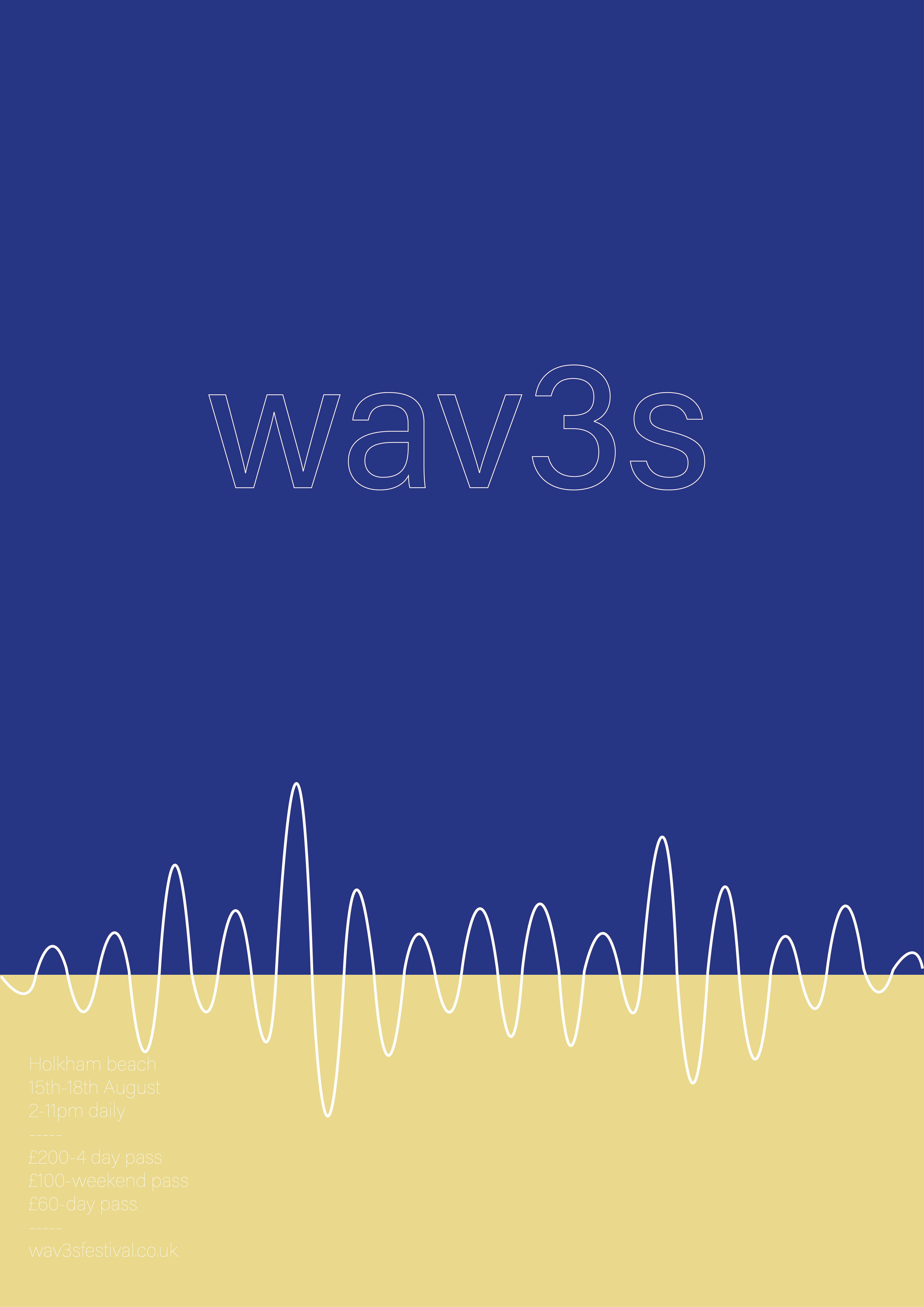
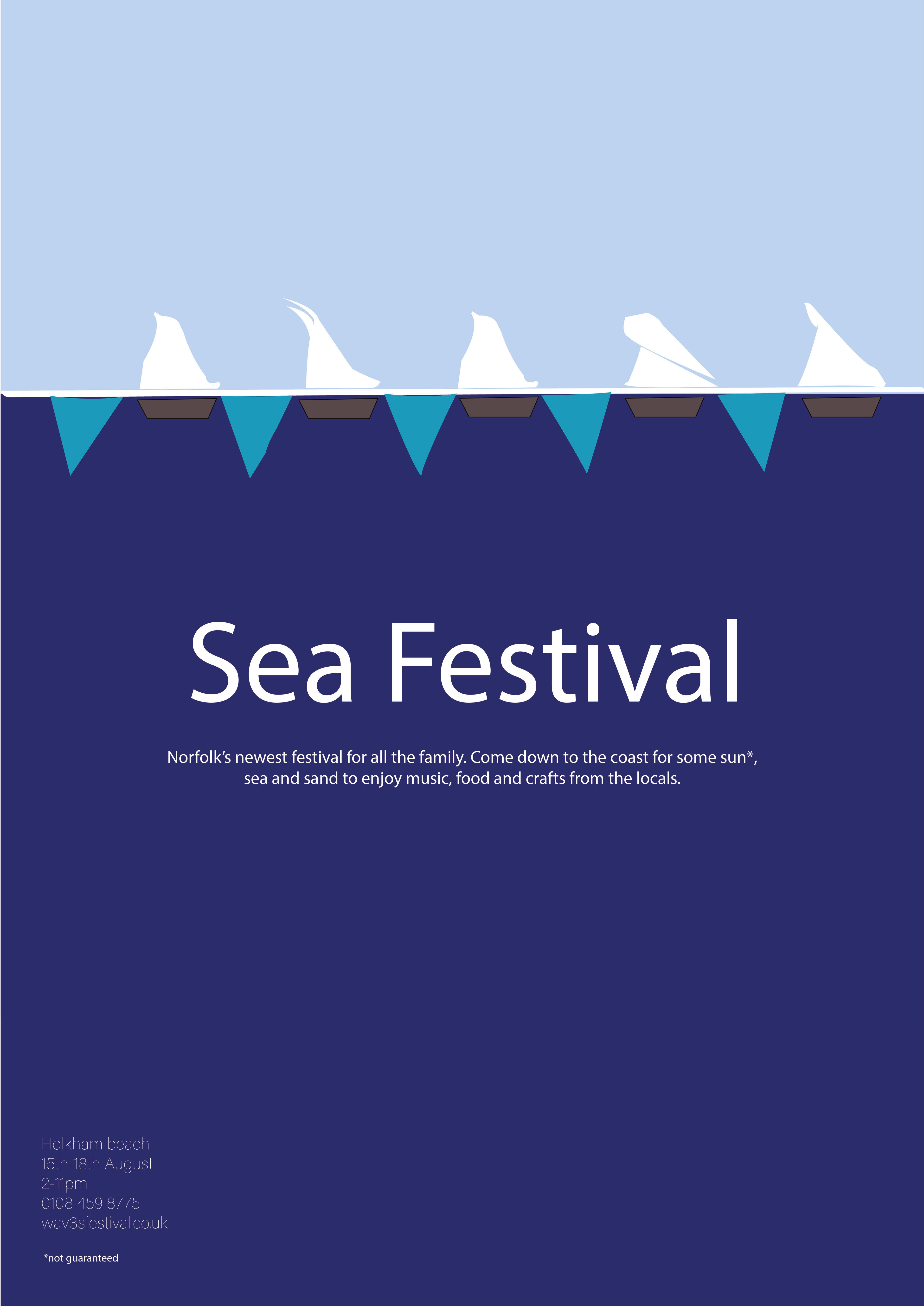
(Below:) Final printed poster to link the bunting used at festivals and waves from the beach, as well as a few boats hidden through the design. The type was influenced from research into hand rendered boat names.


