I was approached to design a logo for a consultancy company. As with many consultancy companies, they are there to give advise and their specialisms are what make them stand out.

The logo needed to remain corporate and thus the mark is minimal and simplistic. Alongside the type element, I incorporated an icon that would bring in some character and uniqueness to the logo, highlighting that they cover a variety of areas and encompass several specialisms.
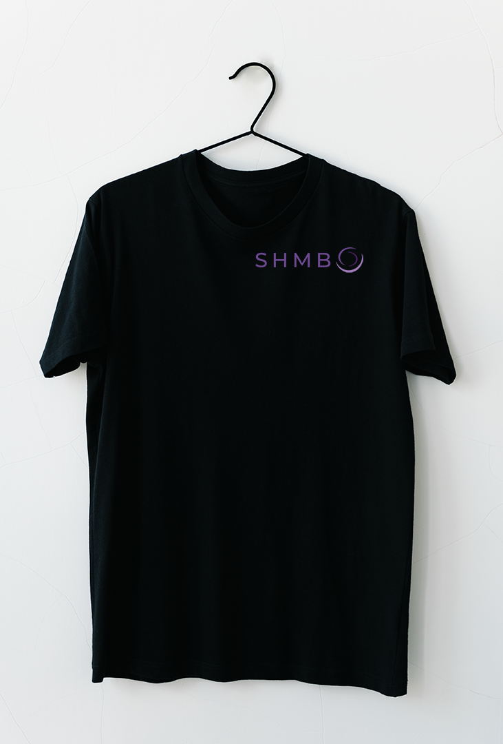
The logo was also to be placed on several collateral including t-shirts, printed matter and digitally. So it was key the logo be a simplistic mark that worked in a variety of formats. I decided to use tonal colours and keep to purple to portray a sense of knowledge and devotion to their craft.