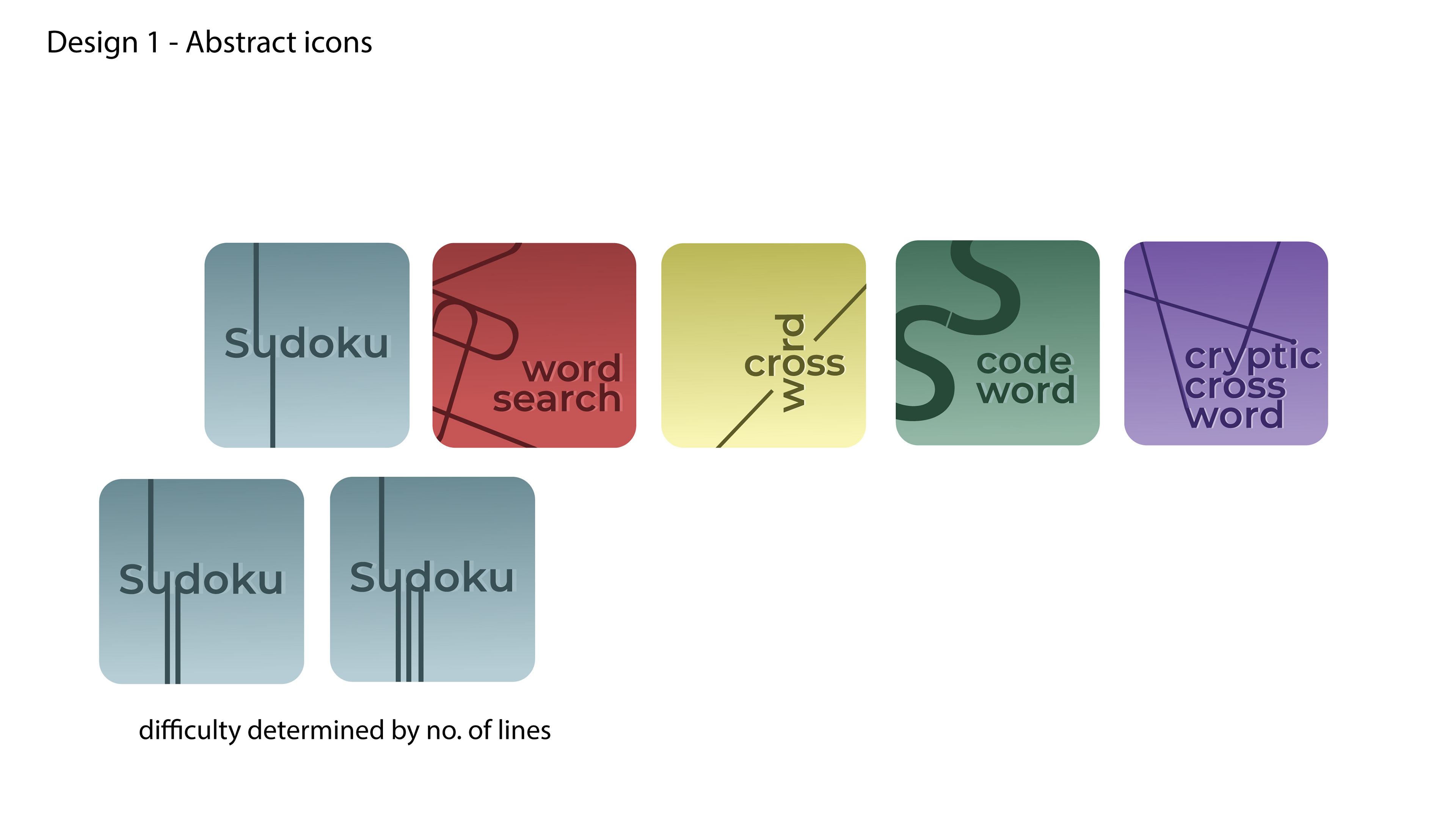
The brief was to create a set of puzzle icons. These were to be used in app and had to be minimal yet strong in their communication.
After research and initial ideas, I ended up on 2 outcomes to show the client, an abstract version and then a word centred version.
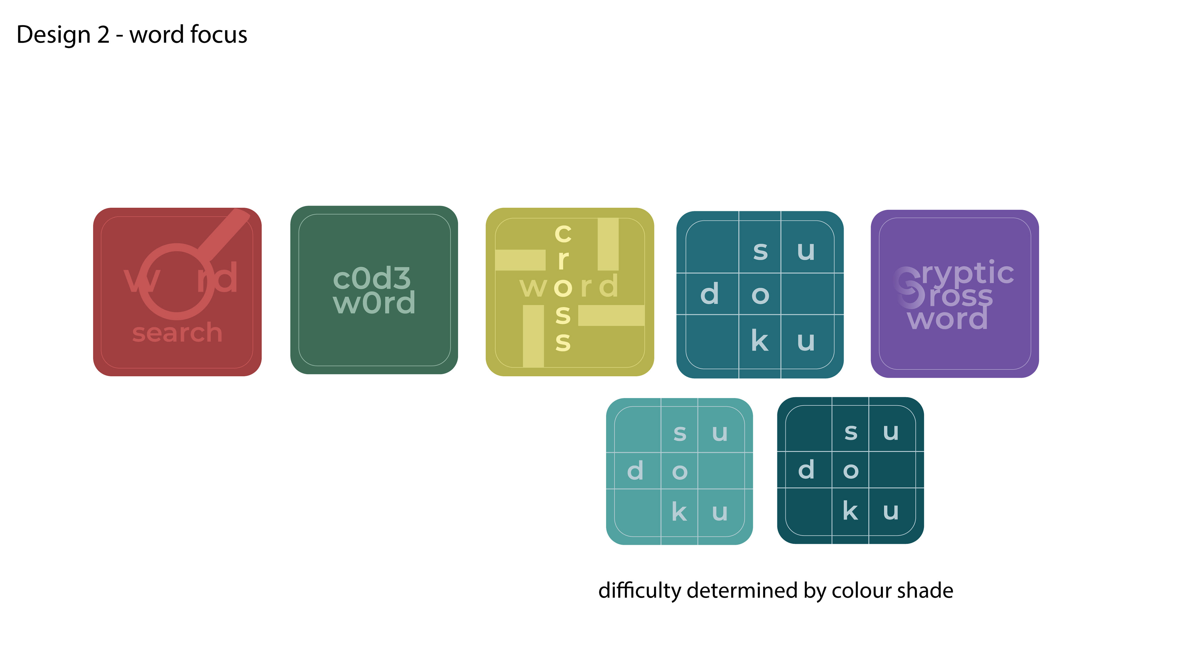
Following feedback from the client, they decided Design version 2 was their preferred route and the below are the final versions.
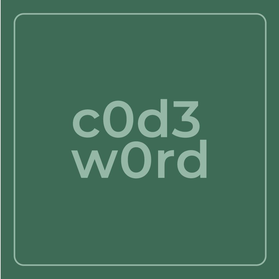
Codeword
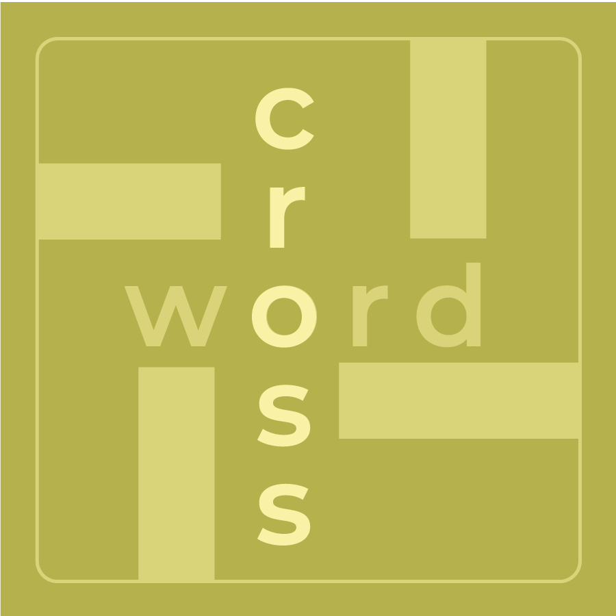
Crossword

Cryptic Cross Word

Wordsearch
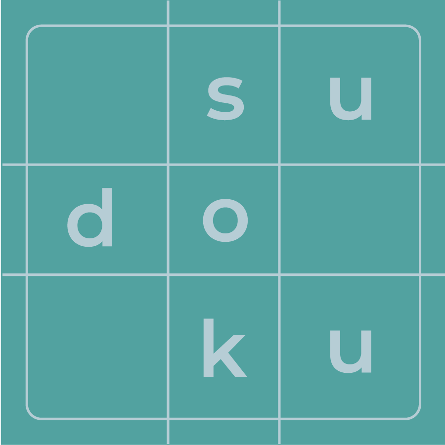
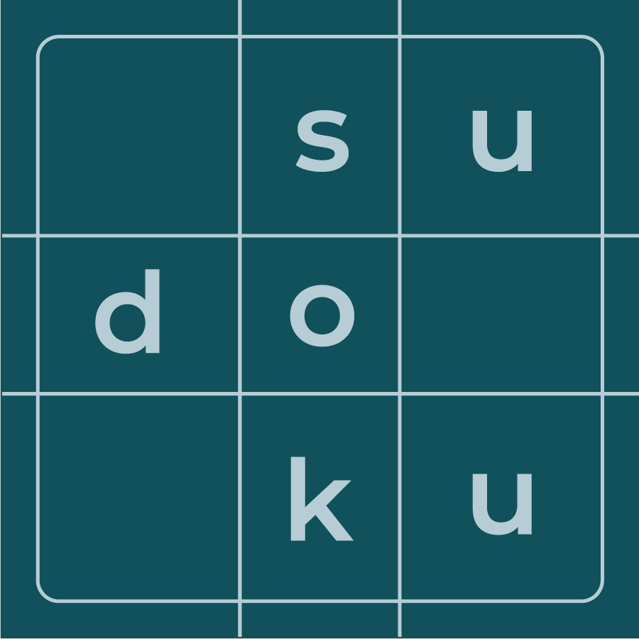
Sudoku: Easy
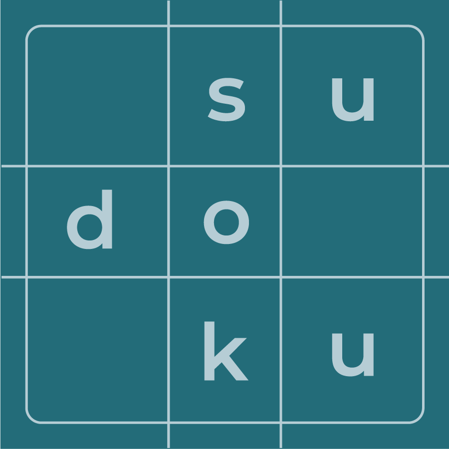
Sudoku: Medium